ENFRA
—
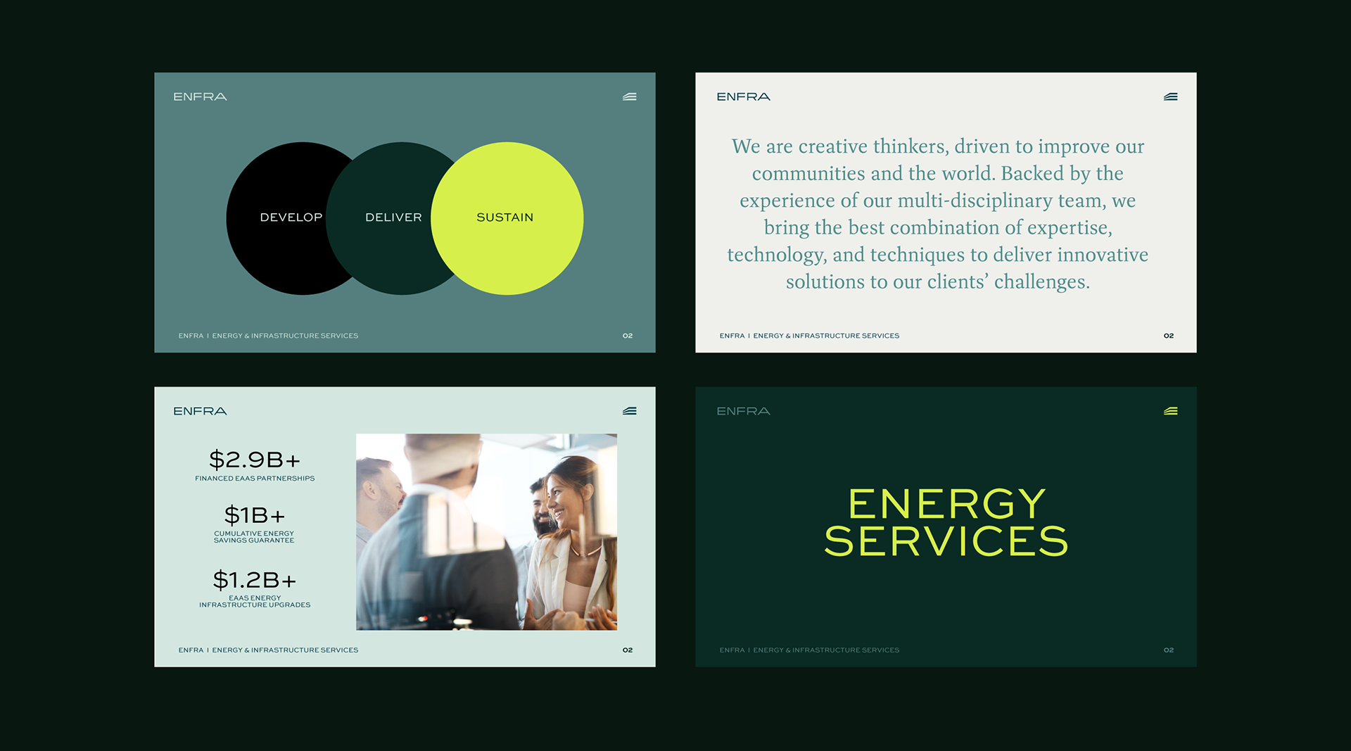
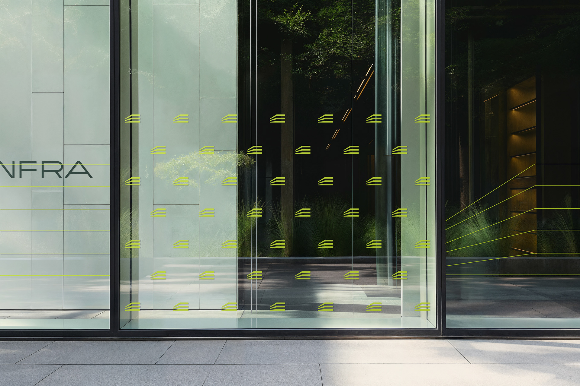
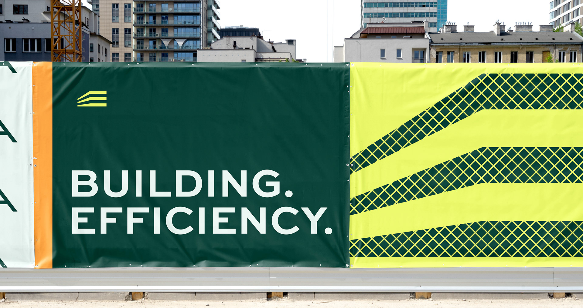
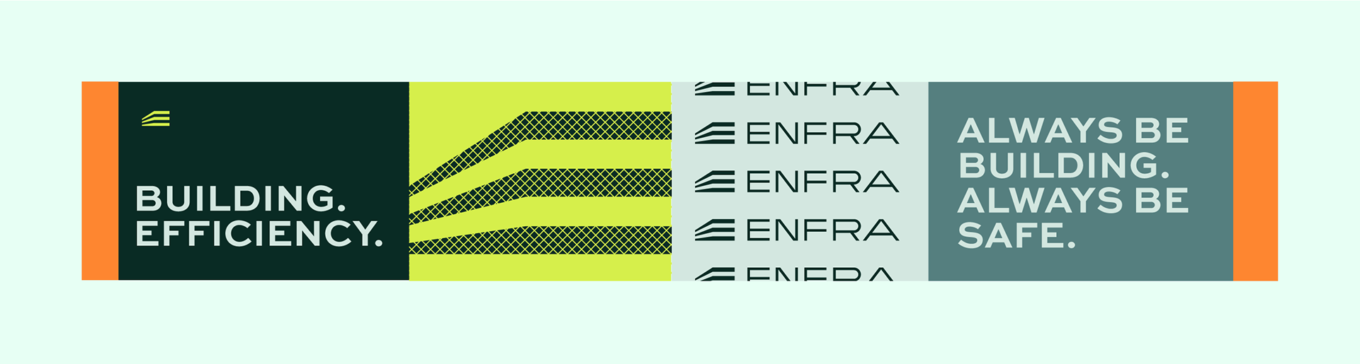
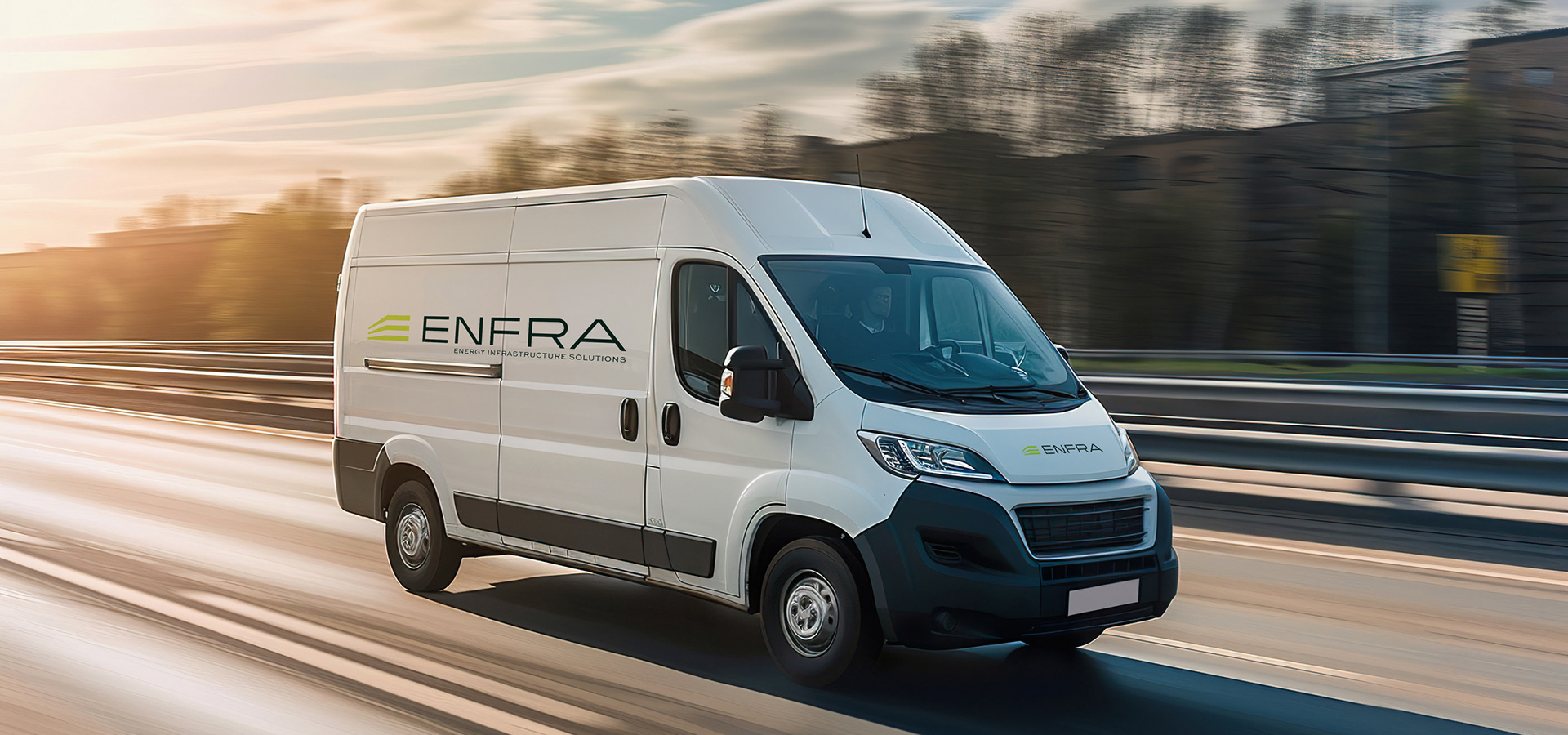
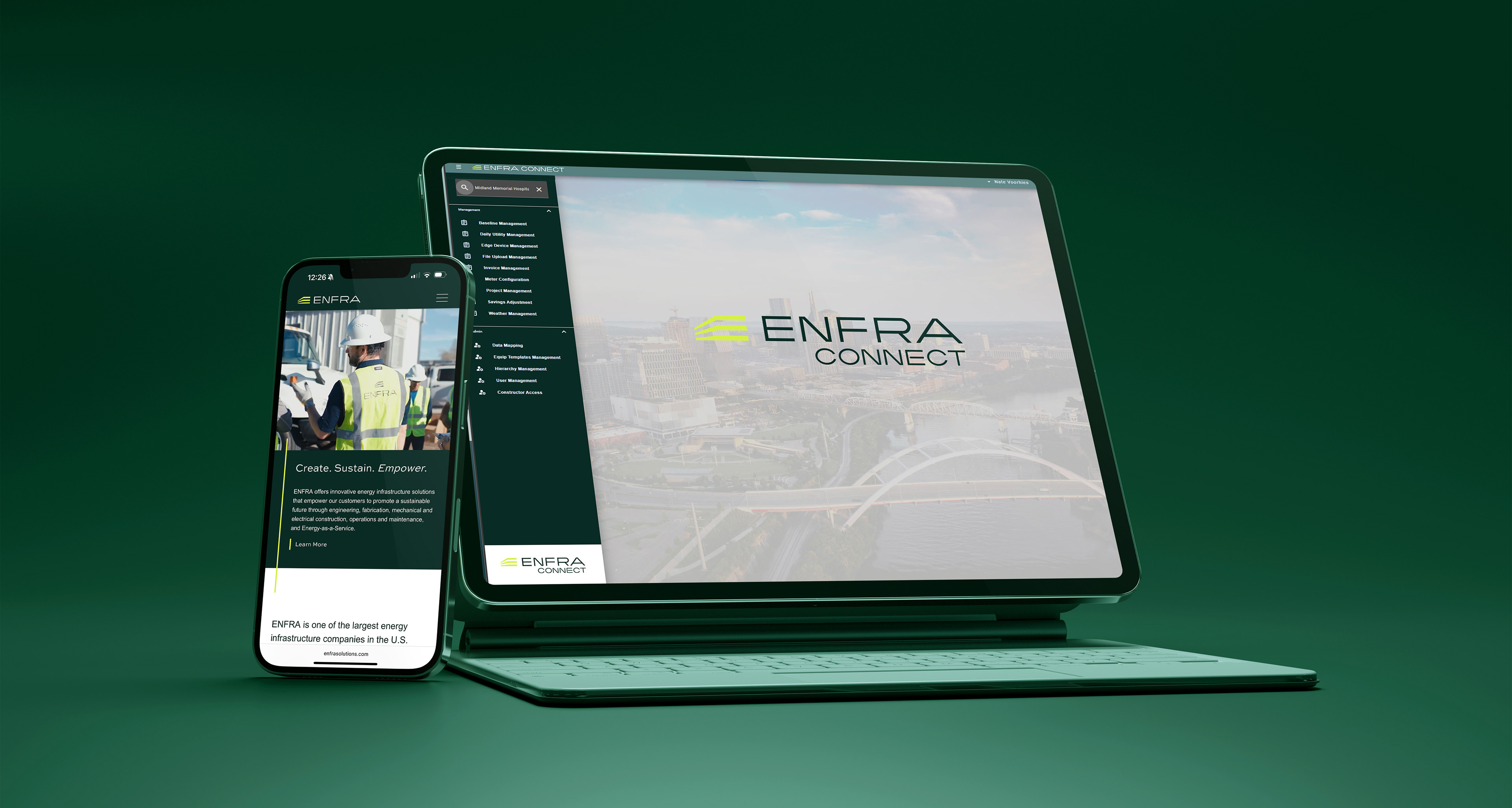
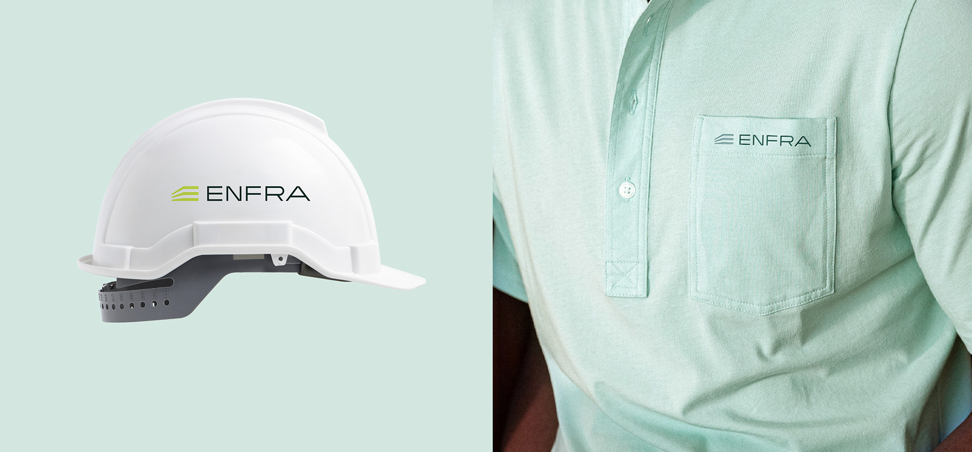
ENFRA was a rebrand from Bernhard. We worked with their internal group on the identity overhaul, settling in on the perspective E. The mark is a 3D perspective of a building shell comprised of three floors. One for energy. One for Infrastructure. And one for Solutions. ENFRA is an energy solutions company. For more than 100 years, ENFRA has provided innovative, client-focused energy infrastructure solutions to guide customers in achieving greater energy efficiency. And we thought the logo should match that level of efficiency. Simple, clean and effective.